
Background —
Art'otel is a luxury international hotel brand, with, as the name suggests, a focus on art and creativity. When their new London site opened in Shoreditch, they commissioned me to name and brand their hospitality-focused premium events floor.
The building stands on the border of London's financial and creative districts and is therefore a gateway to two different markets. Going too corporate risks alienating creative clients, and vice versa. But being too much of a compromise could leave it speaking to nobody. This was the project's biggest challenge.

Project —
With no shortage of event spaces across London, Art’otel was keen for this offer to feel genuinely different. Both the name and the identity were therefore rooted in what made the space unique: the distinctive cylindrical form of the building and the uninterrupted 360-degree views across the city.
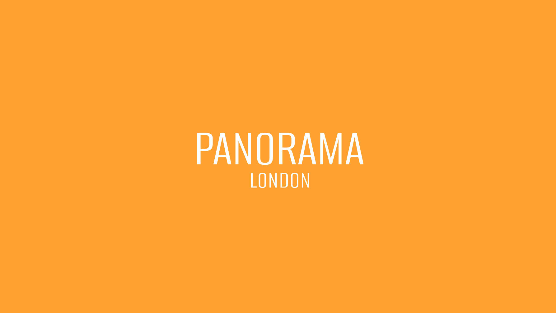
As the other public-facing spaces within the hotel draw their names from the art world, it was important that this followed the same logic. Allowing it to function as a distinct destination while still sitting comfortably within the hotel’s wider nomenclature.
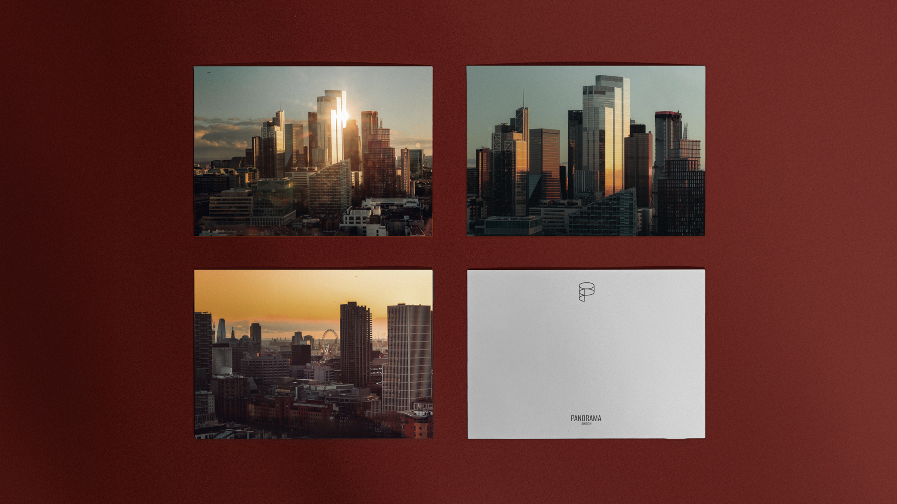
The name is inspired by the works of 19th-century artist, Robert Barker, who first coined the word Panorama. Barker's Panorama was built in Leicester Square and featured a raised platform accessed by stairs, from which observers could see a 360 degree view of a large curved painting which encircled the viewer. The experience closely mirrors that of the events floor itself: an immersive, uninterrupted view of the London skyline, 24 storeys above ground.

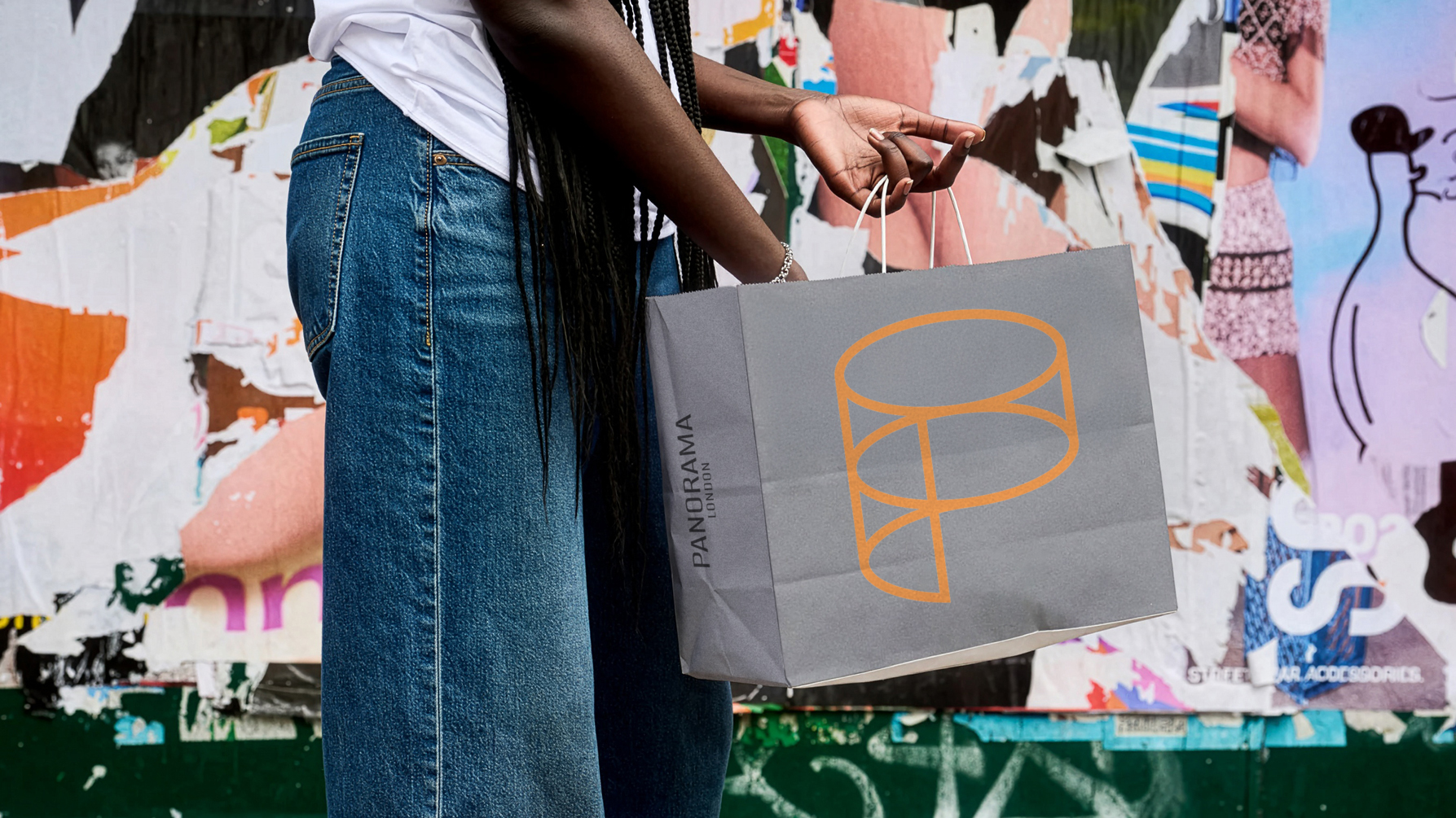
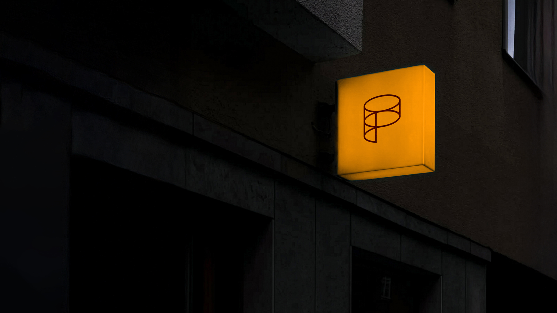
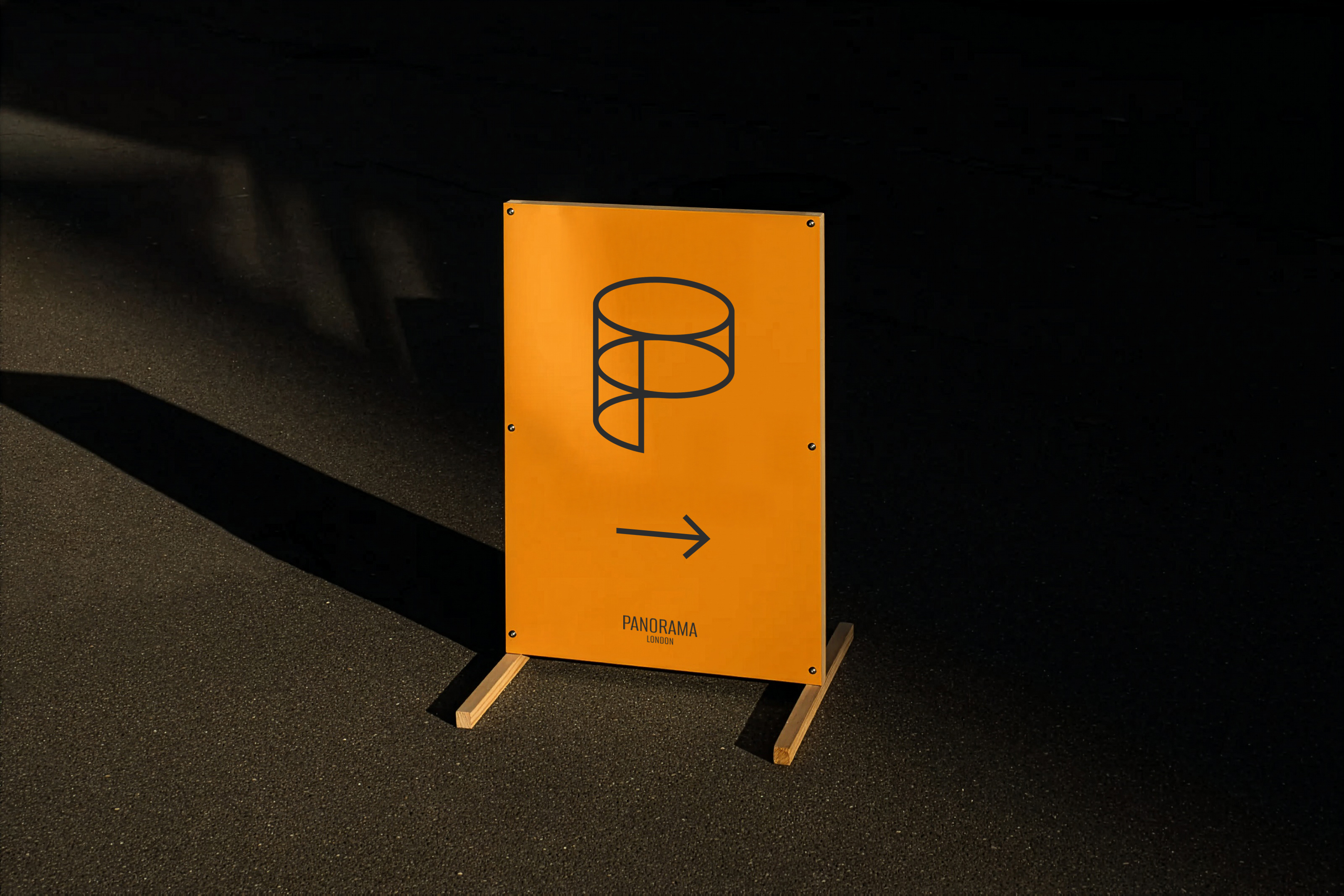
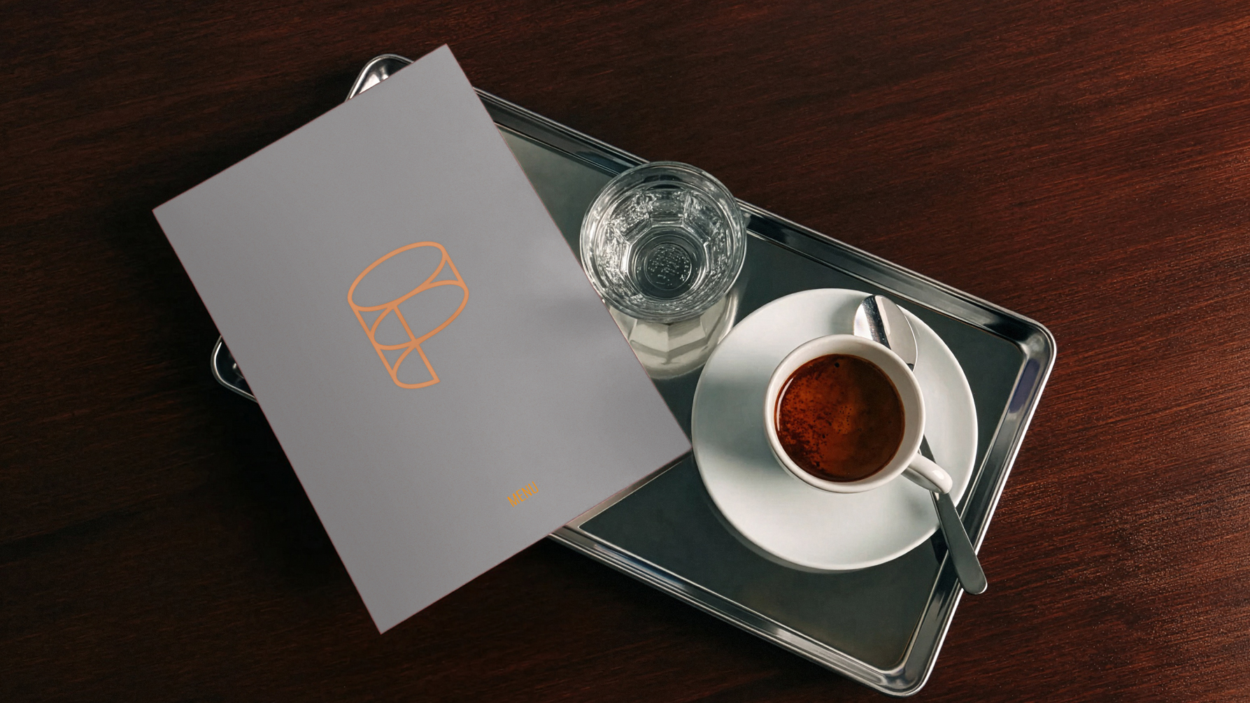
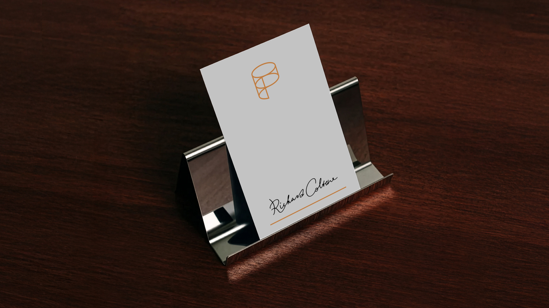
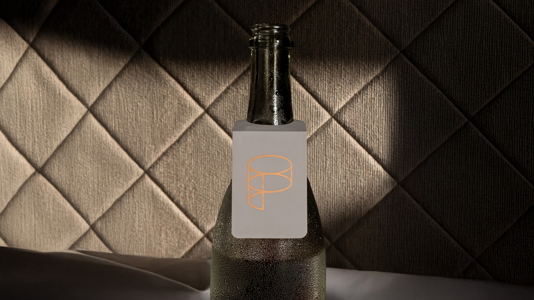
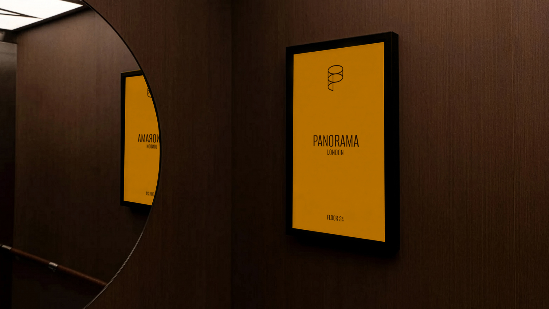
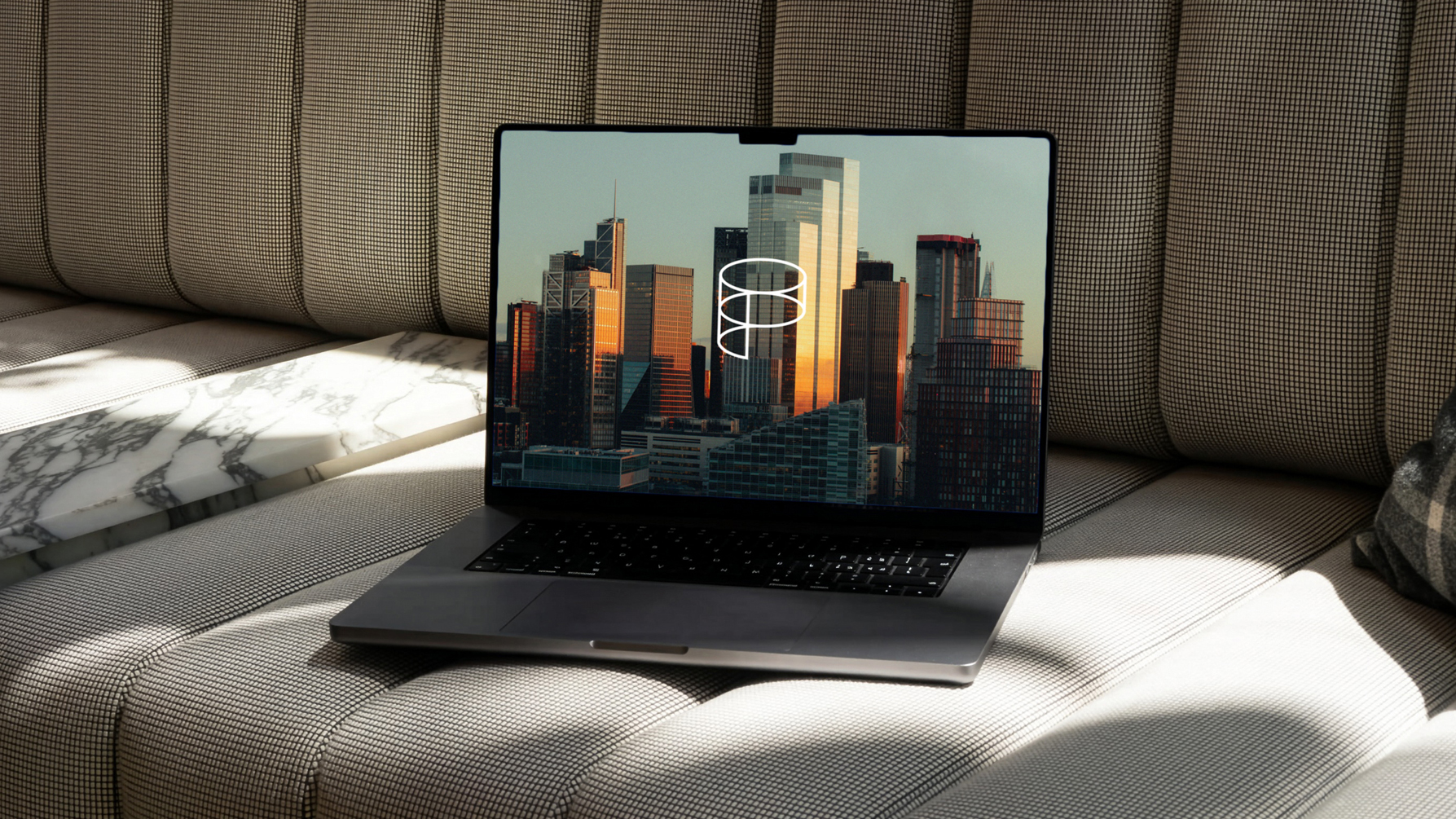
The logo takes the form of an exploded view of a cylinder, split into stacked layers that echo the structure of the building while resolving into the letter P.
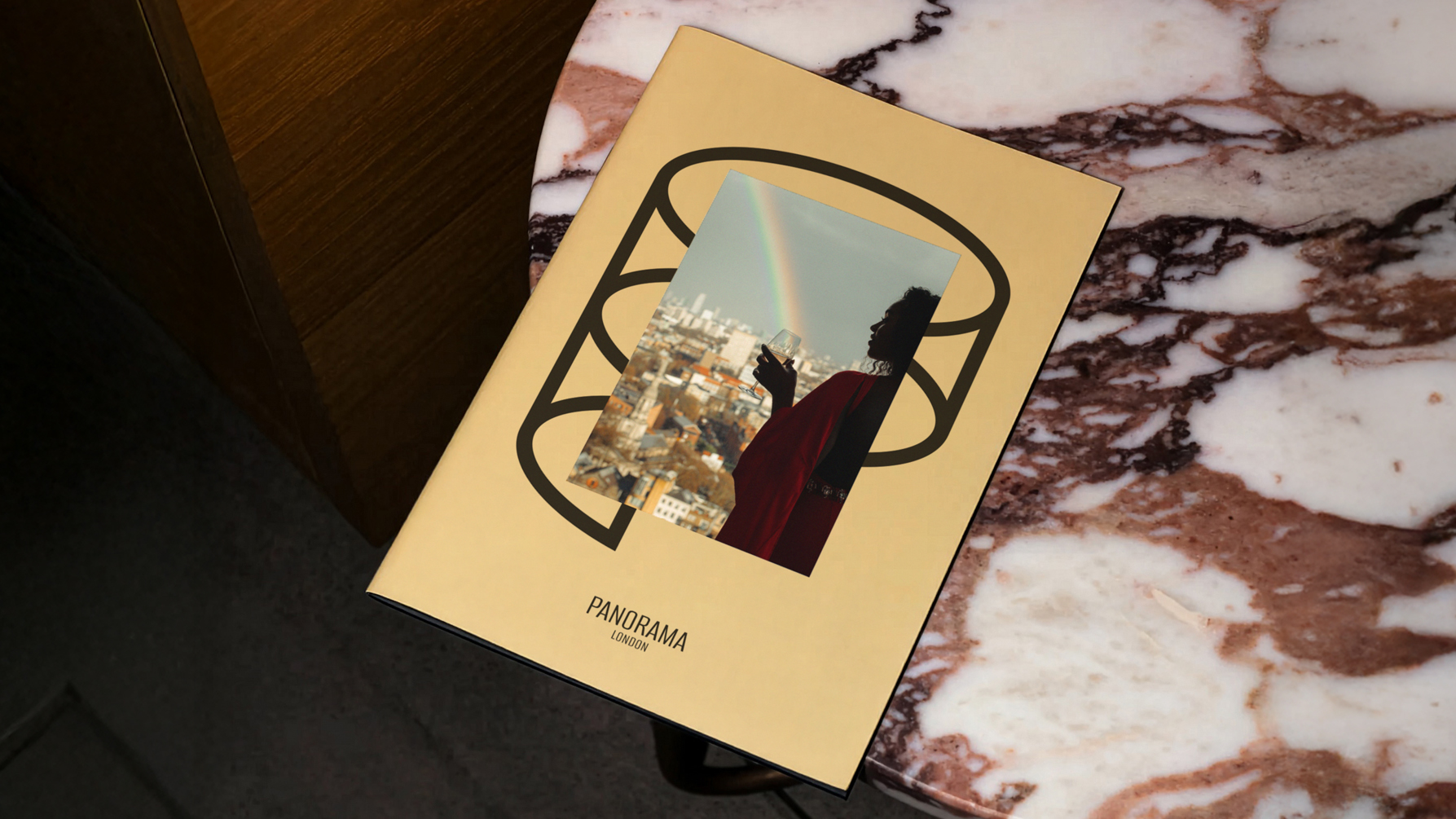
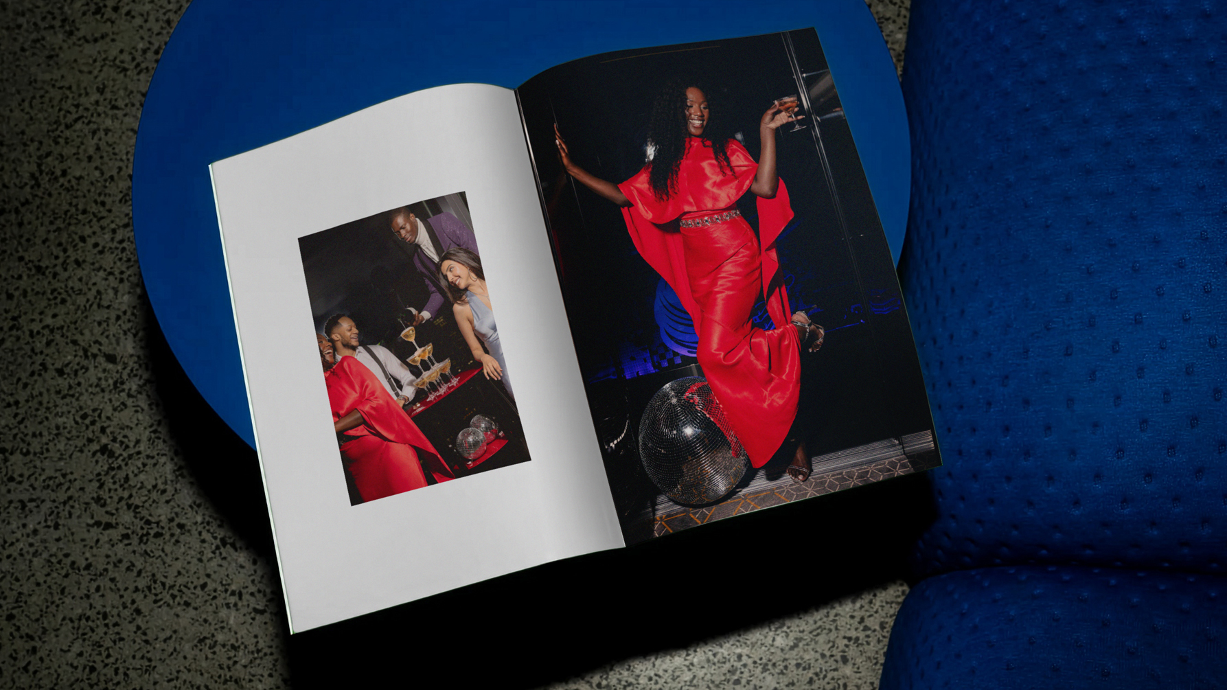
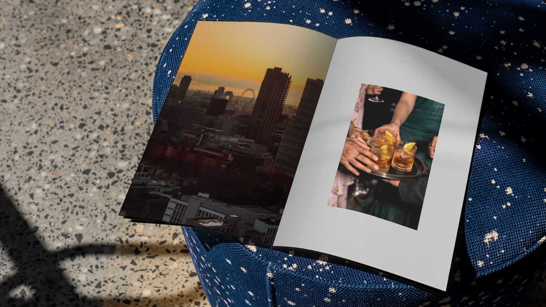
Beyond the logo, the project encompassed a full suite of bespoke printed, environmental and digital collateral. A fixed colour palette was introduced for applications without imagery, creating consistency across materials while allowing the commissioned photography by Rebecca Hope space to breathe. The photography was deliberately focused on bringing life and personality to the space, avoiding the usual catalogue of empty rooms.

Flexibility was built into the system from the outset. There is no fixed logo lock-up, allowing the symbol and wordmark to be used independently or together. Combined with the colour strategy, this meant the identity could shift subtly - more corporate when required, more expressive when appropriate - while remaining coherent and recognisable.
The result is an identity that speaks authentically to very different audiences and has successfully attracted clients from both ends of the spectrum. Such has been the success of the project since launch that Art'otel are converting an additional floor of the hotel into further event space to cater for the high demand.