Background —
Buro is a global luxury fashion and lifestyle brand, owned by News Corp. They have offices in 11 countries and recently set up a new London HQ, recruiting some big names, with the aim of unifying and developing their editorial content into a new, relaunched website and social channels.
Previously the singular vision of its founder, post-acquisition, the business suddenly found itself without a central creative strategy to underpin its ambitious expansion. This vacuum made it hard for the staff, both new and old, to make decisions on what was right or wrong, preventing them from having a clear identity for their written and visual content.
Project —
I was brought in to help identify the brand’s style and tone, communicate it to their staff and then work with them on the creation of assets for the launch.
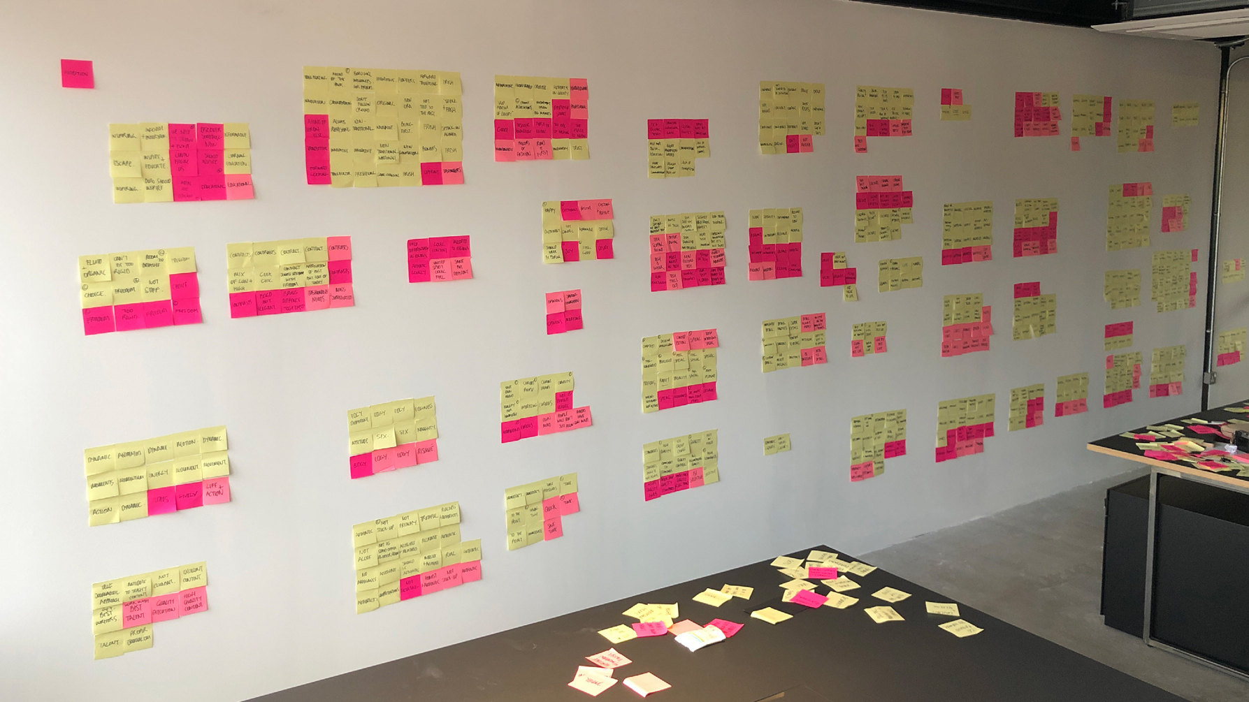
Fortunately, a lot of very talented creative people are within the business, so the first thing I did was spend time with as many of them as possible. I felt that if I could find what unified the internal thinking this would provide a solid creative foundation for the whole company to move forward with coherently.
This strategy would be something with which everyone agreed, had played a part in and, crucially, wasn’t based on subjective, individual taste - which would have pulled the brand in numerous different directions.
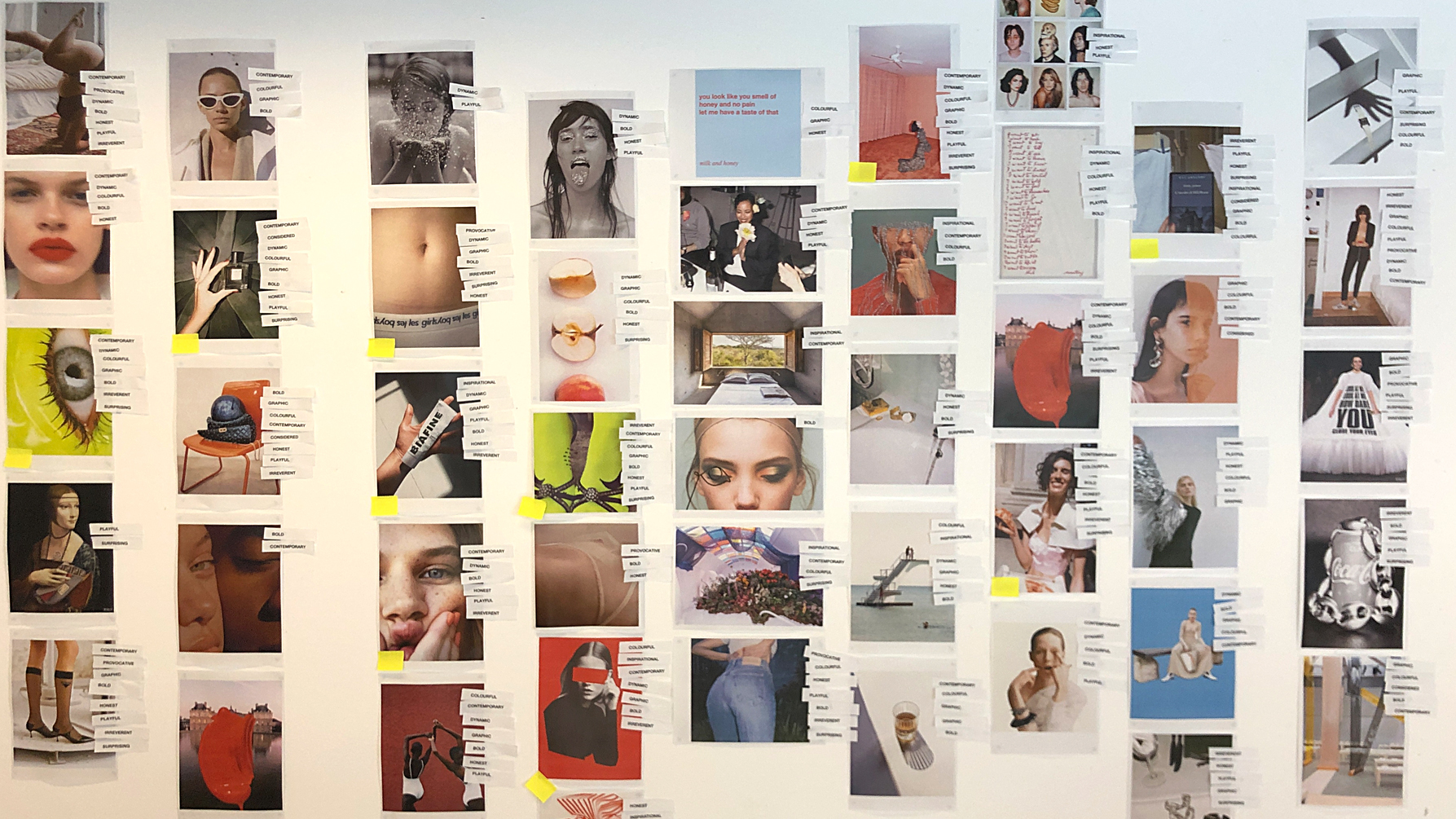
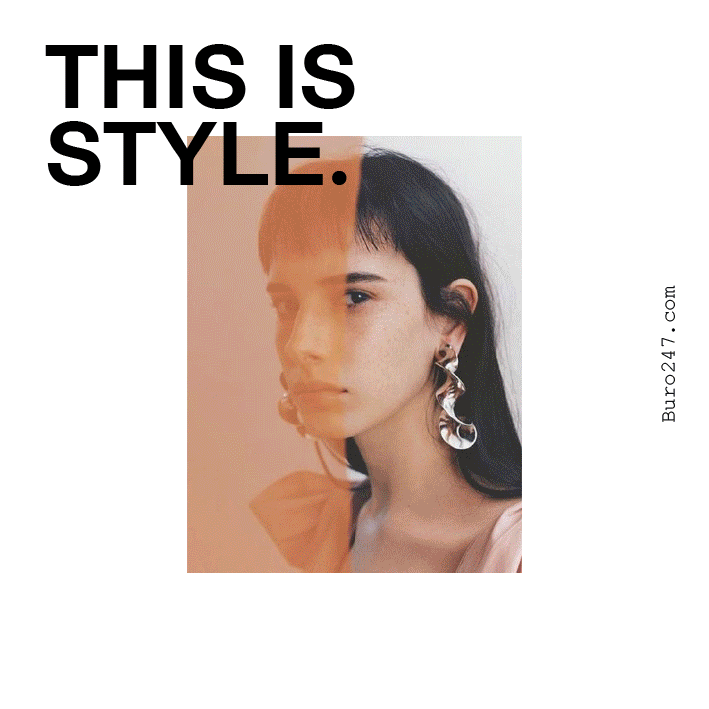
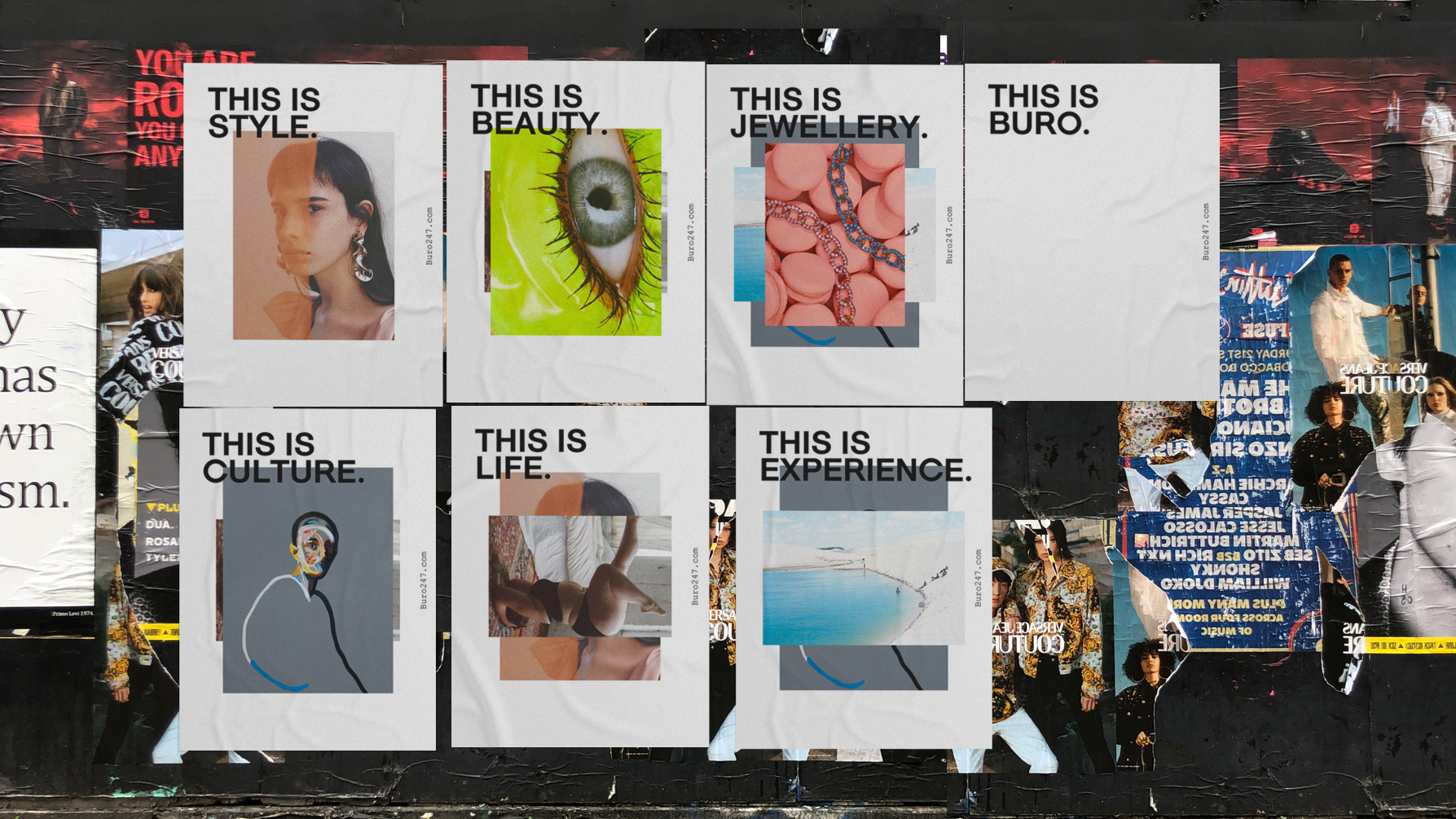
What came out of these conversations was a sense that humour, intelligence and a little bit of weirdness were right for the general tone, and visually it should be bold, colourful and dynamic - with motion a key aspect to how imagery should work both editorially and on socials.
I formalised this Buro DNA into style guides and spent time with the staff to explain how they could use them in their part of the business.
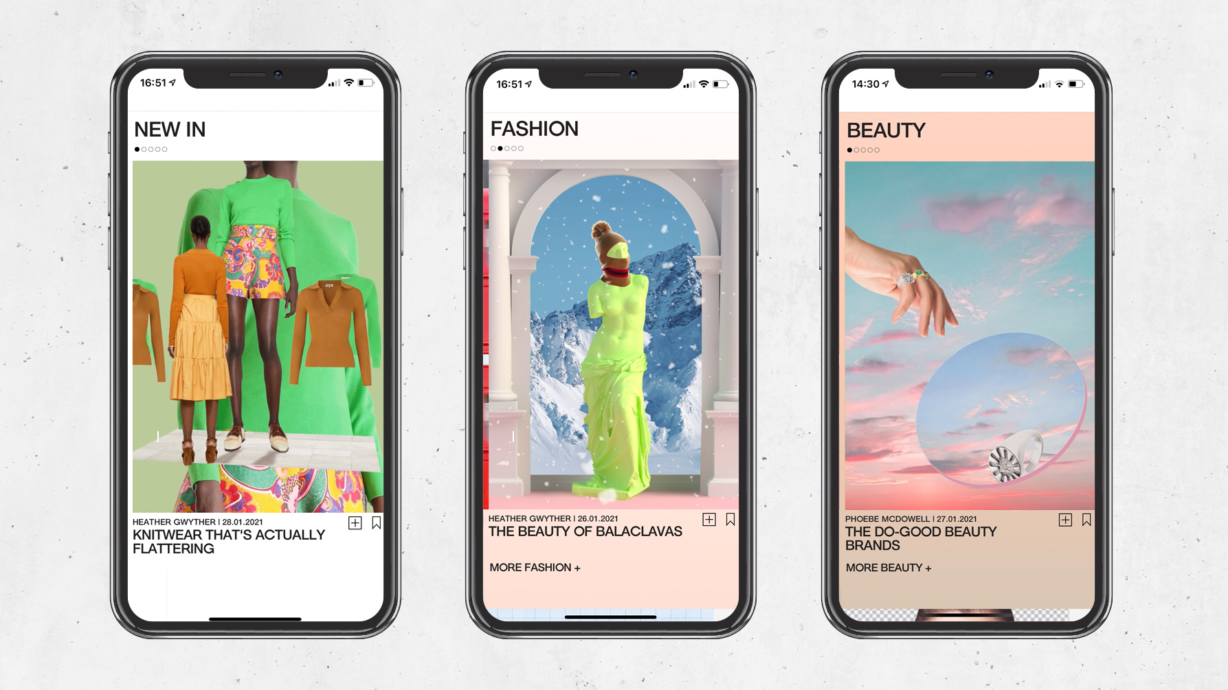
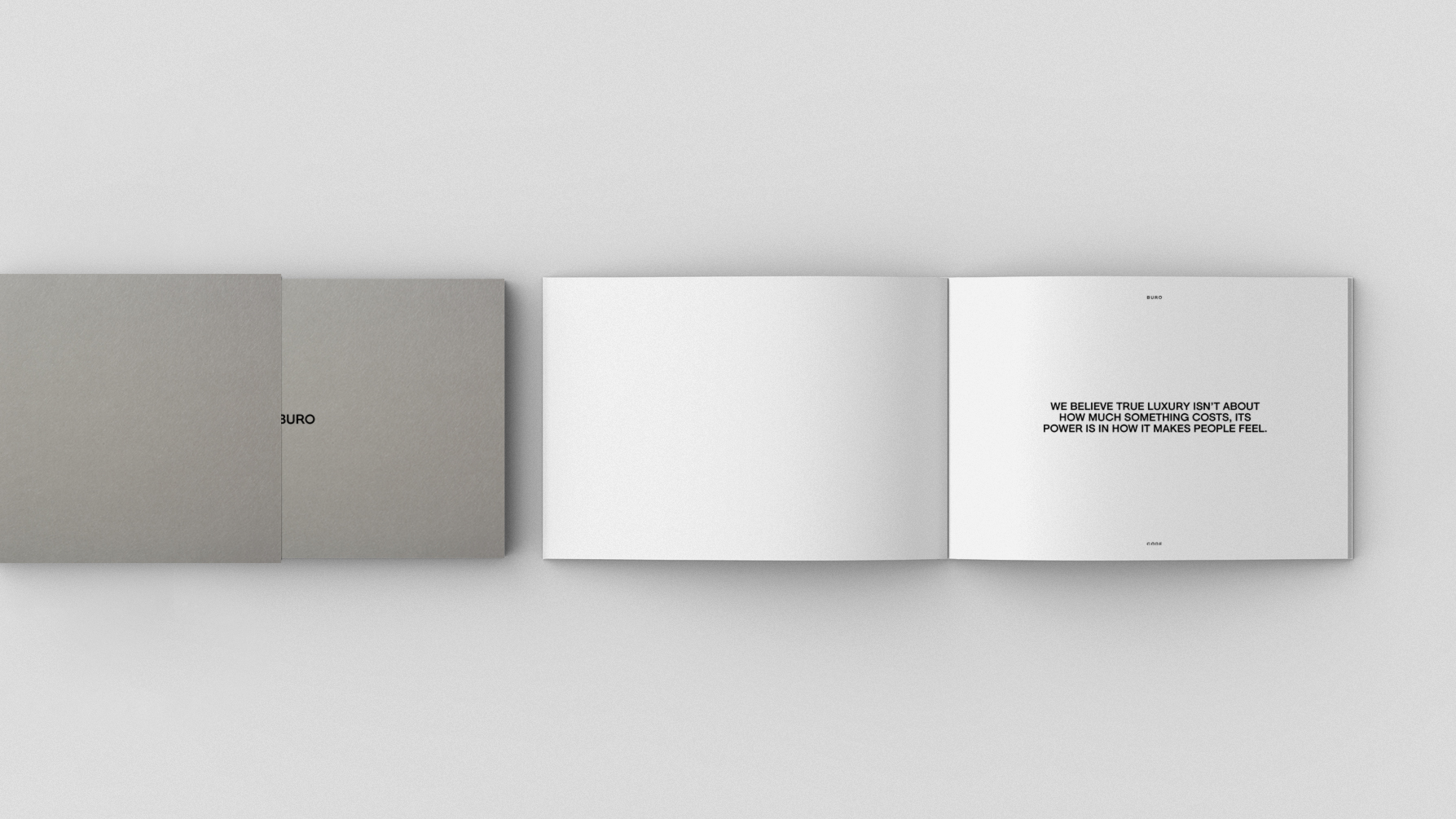
Given that the brand would have the written word at its heart, it made sense to create for them a bespoke font. This would ensure that all of their writing would have a distinctive visual style. I also updated their existing logo to align with the new font.
I worked closely with their in-house editorial and creative teams, specifically the art director Duncan Woods, on the design of the new website, its content, their Instagram channel and launch collateral, ensuring that everything was visually and tonally consistent. They were able to move forward with speed, confidence and independence to produce the work you see here.
Simon has the most incredible way of working that allows everyone involved in a project to be a part of the change. It feels very organic, but at the same time totally game-changing.
He took our rudimentary concept and honed it until we had an industry-leading visual product that truly reflects our brand values. His method helped excite and unite the team so we fully understood what we were working towards. I cannot recommend his aesthetic or his approach highly enough.
The world of digital publishing, especially within the fashion, beauty and lifestyle areas, is notoriously oversaturated making it very hard to stand out. However, their fresh, contemporary and dynamic visual identity did just that.