
Background —
Last Night On Earth is the record label and events brand for the legendary DJ, Sasha, one of electronic music’s most influential and enduring figures. The brand operated within the Three Six Zero Group, a globally recognised management and entertainment business representing artists at the very highest level of the industry. I was approached to completely refresh and reposition Last Night On Earth and equip it for its next phase of growth.
Project —
The brand's products, the music releases and live events, were strong and well received, and the association with Sasha gave the brand immediate credibility. However, visually and tonally, Last Night On Earth wasn’t cutting through as effectively as it could. In an industry crowded with highly distinctive brands, its identity lacked the personality and memorability required to properly stand out.

Left unresolved, this risked limiting the reach of the work and causing the brand to plateau. For an artist with Sasha’s ambition, influence and history within dance music, that felt like a missed opportunity.

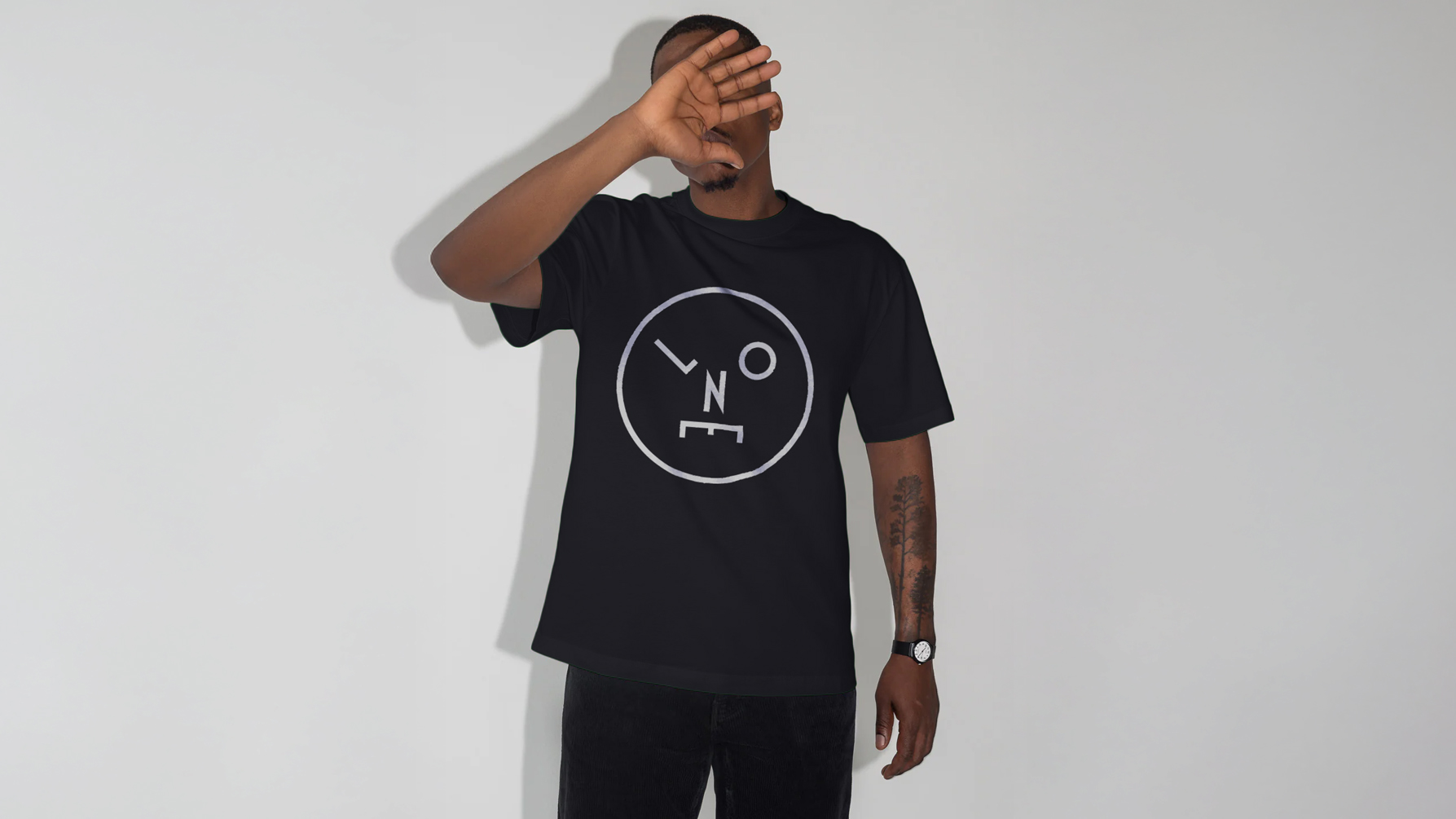
My starting point was the belief that the brand needed a mark with real character. Something distinctive, irreverent and alive, that reflected the spirit of nightlife rather than the increasingly serious and sterile aesthetic common to many electronic music brands. It also needed to function seamlessly across a wide range of touchpoints, from vinyl and event posters to digital platforms and lifestyle products such as clothing - which plays a crucial role in how music brands gain attention today.
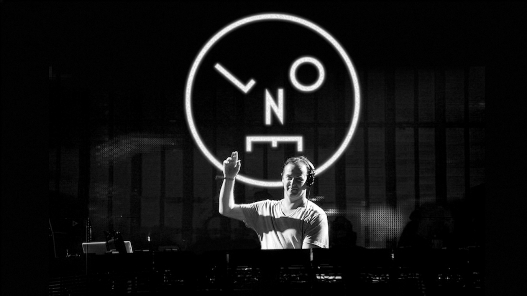
I developed a symbol using the initials of Last Night On Earth, transforming them into a face graphic that felt wonky, slightly unhinged and a little worse for wear. A visual shorthand for the reality of clubbing rather than a polished abstraction of it. Given Sasha’s place in dance music history, the reference to the culture’s unofficial Acid Smiley was deliberate. This could be seen as its distorted, battle-scarred cousin.
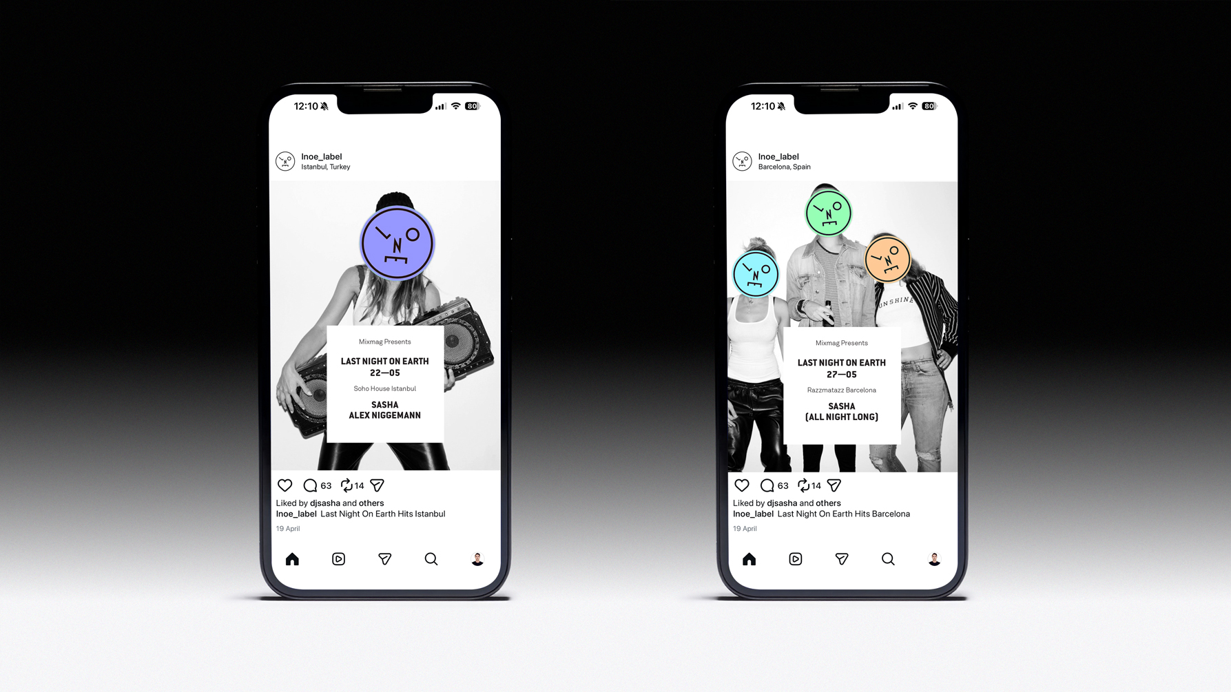
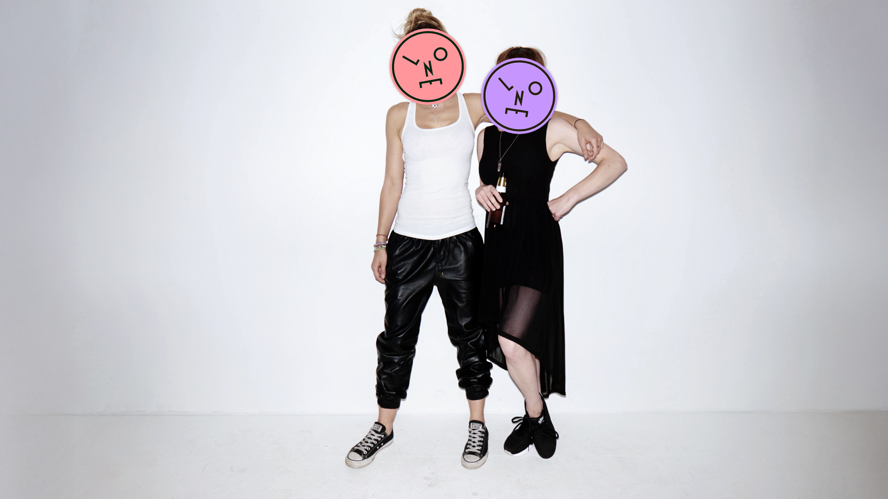
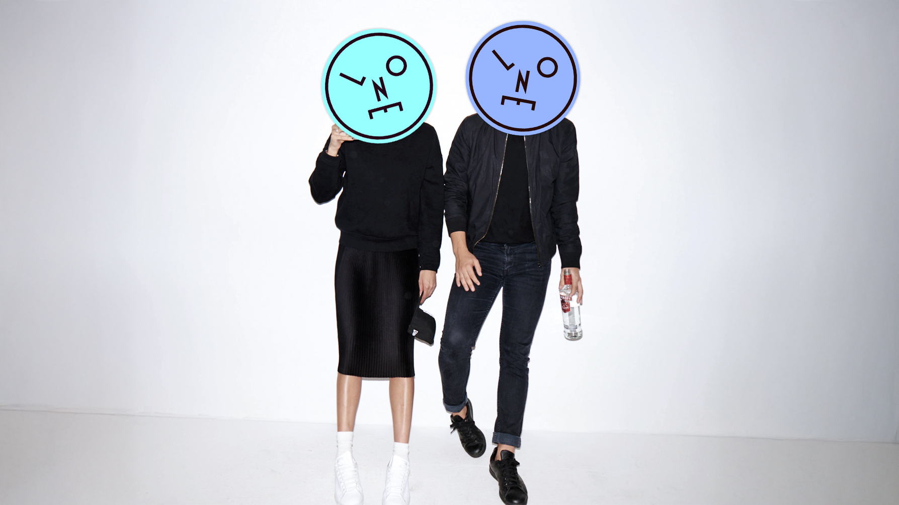
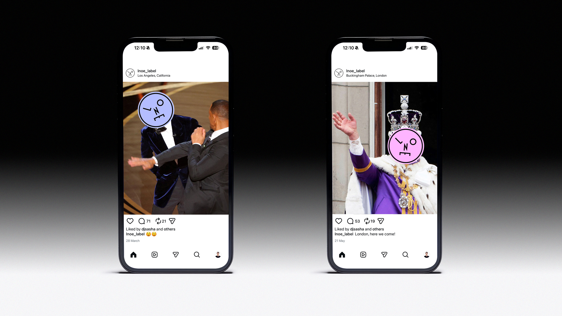
To bring the identity to life, I commissioned a photoshoot built around Sasha’s own audience. We recruited fans via his social channels, threw a party in a photo studio, and photographed people as the night unfolded. The face graphic was then overlaid onto the images like a sticker, obscuring identities and creating a playful, anarchic visual language.
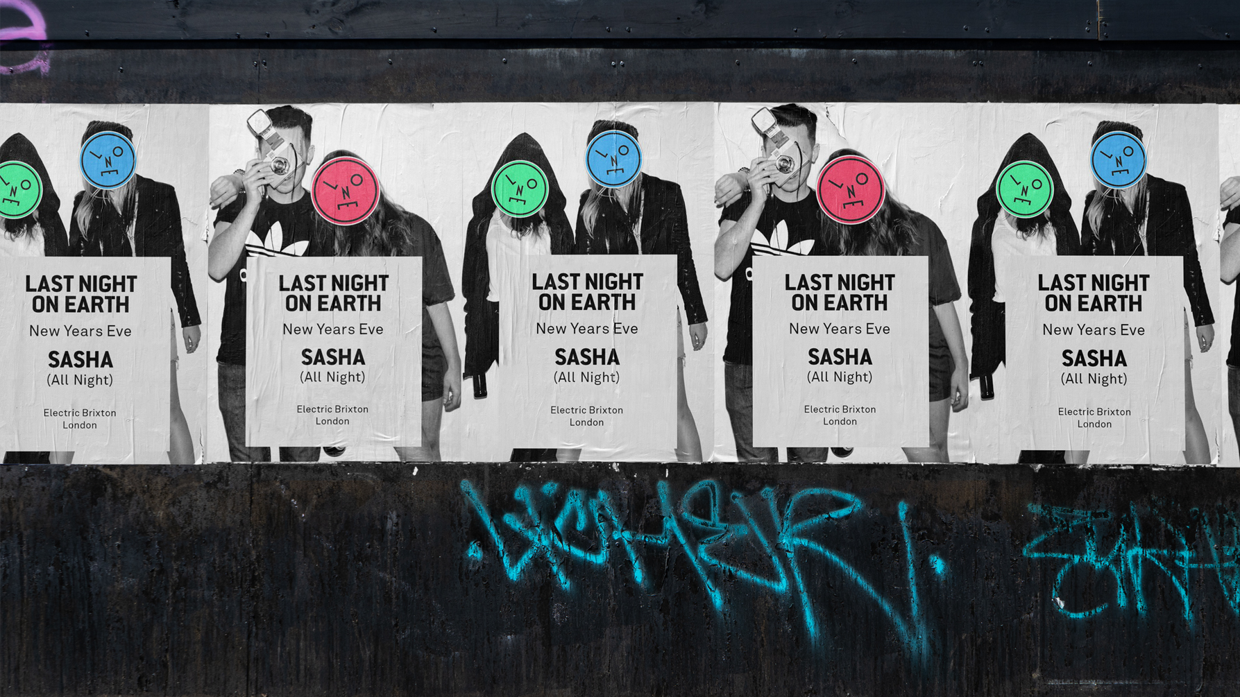
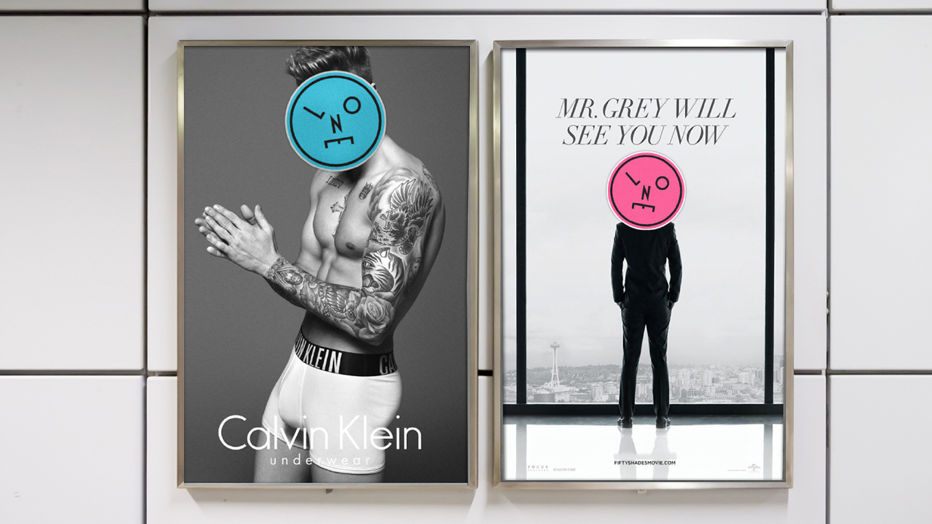
This “stickering” approach became a flexible device that could be applied across event promotion, social media and physical formats, and also enabled more irreverent guerrilla-style activity. This included subverting existing advertising by covering the faces of well-known figures, in keeping with the underground origins of dance music.
The thinking was shaped through extensive conversations with Sasha and his team. I wanted the brand to feel like a natural extension of him, informed by his history, personality and values, rather than something imposed from outside.
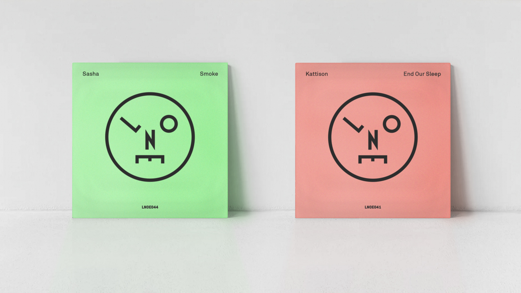
The identity was applied across vinyl releases, event promotion, posters, digital platforms and merchandise. I was responsible for the overall strategic concept, all design work, and the creative direction of the photoshoot.


The result was a reinvigorated brand with a clear and distinctive place within the electronic music landscape. It gave Last Night On Earth a stronger presence, greater confidence, and provided Sasha with a visual world that felt genuinely reflective of both his legacy and his ongoing creative output.