Background —
Toolroom is a music and events brand with a large, passionate fan-base both in the UK and internationally.
They first approached me to do a rebrand for them around their tenth birthday, and, such was its success, I continued to work with them on both strategy and design.

Project —
The company had, over ten years, developed from small origins into a hugely successful business. Along the way, however, they had outgrown their existing identity which was not able to cope with the demands of a far larger and more expansive operation.
Ultimately, this led to a disjointed output and the company felt it was impeding their ability to take the business forward.
I believe that when the company looking to rebrand is already successful, it’s important to build upon what’s gone before rather than junk it out of hand. With that in mind, I wanted to learn from their fans and staff exactly what attributes lay behind Toolroom’s best activity to date. I spent a week in their office meeting with consumers from the UK and internationally together with all staff members to really get under the skin of the brand.
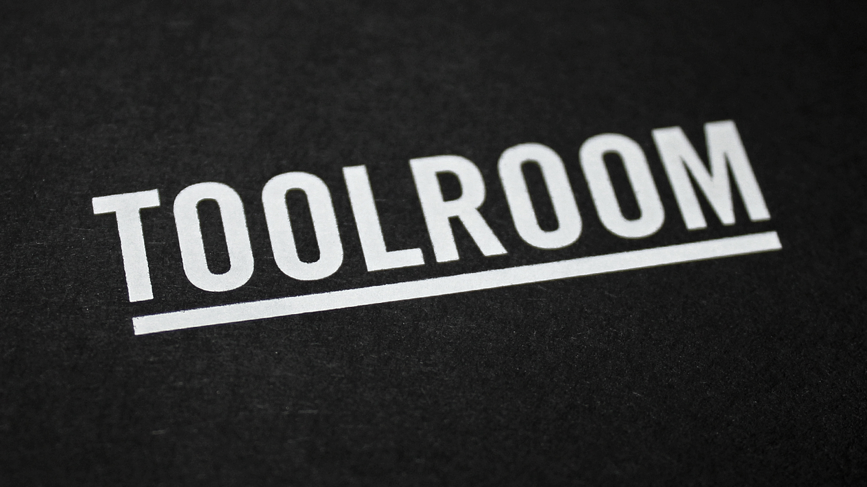
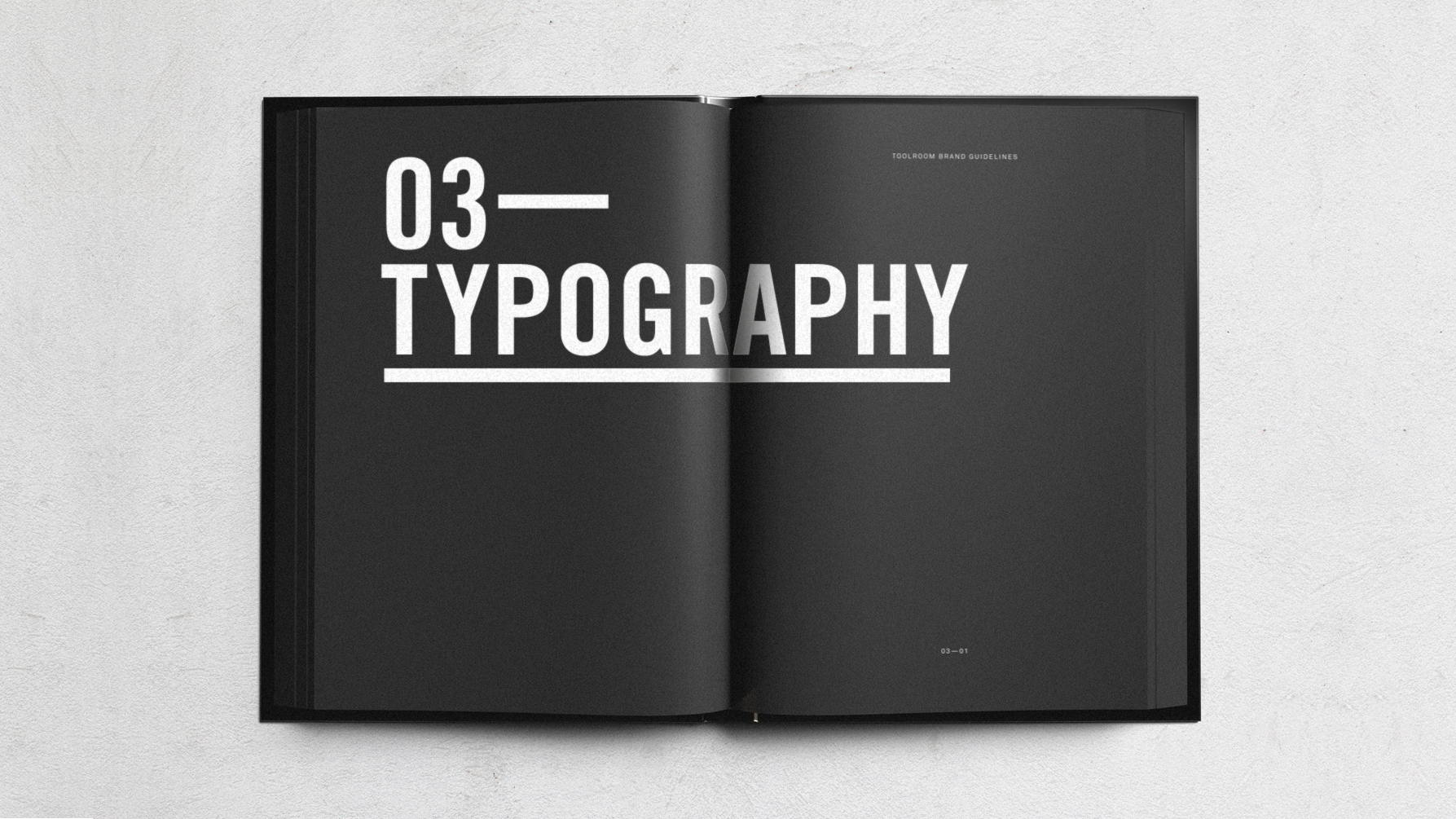
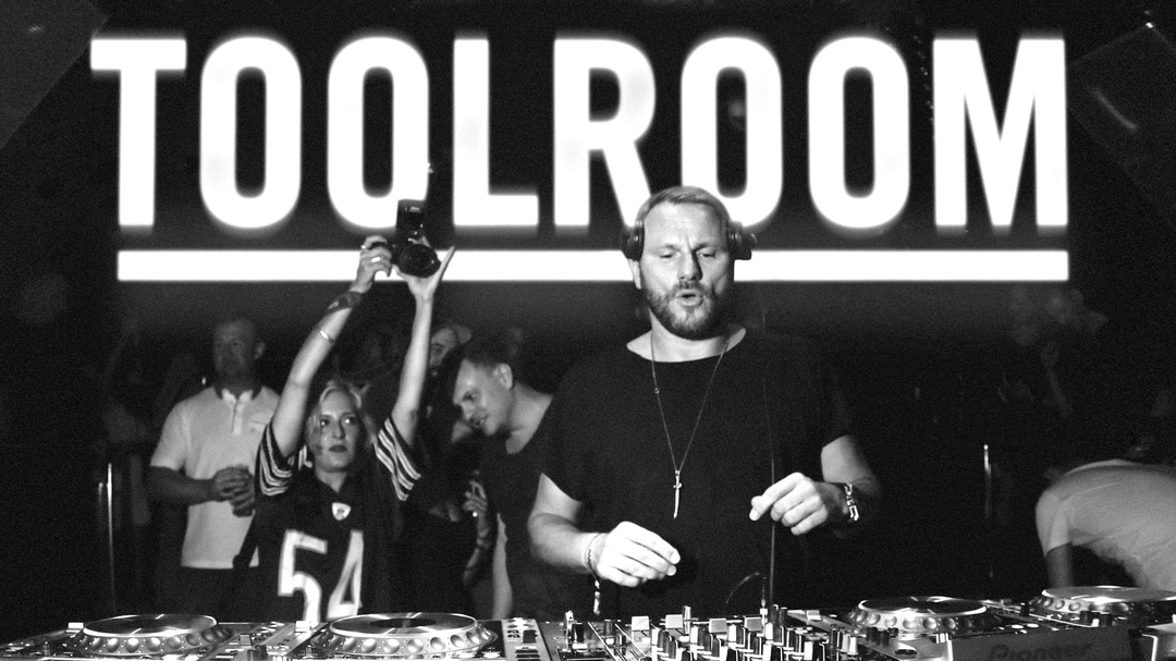
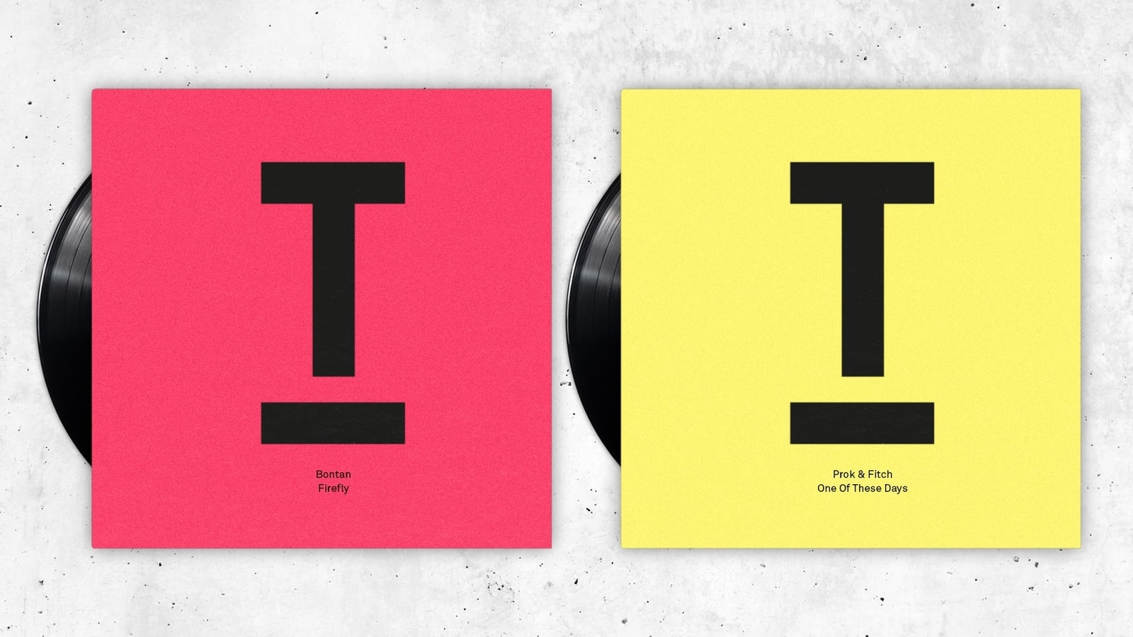
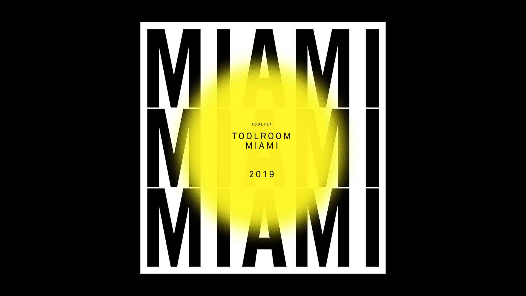
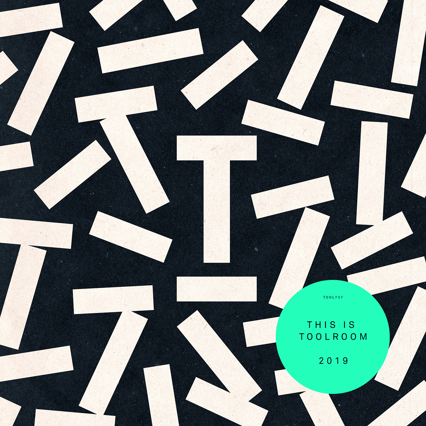
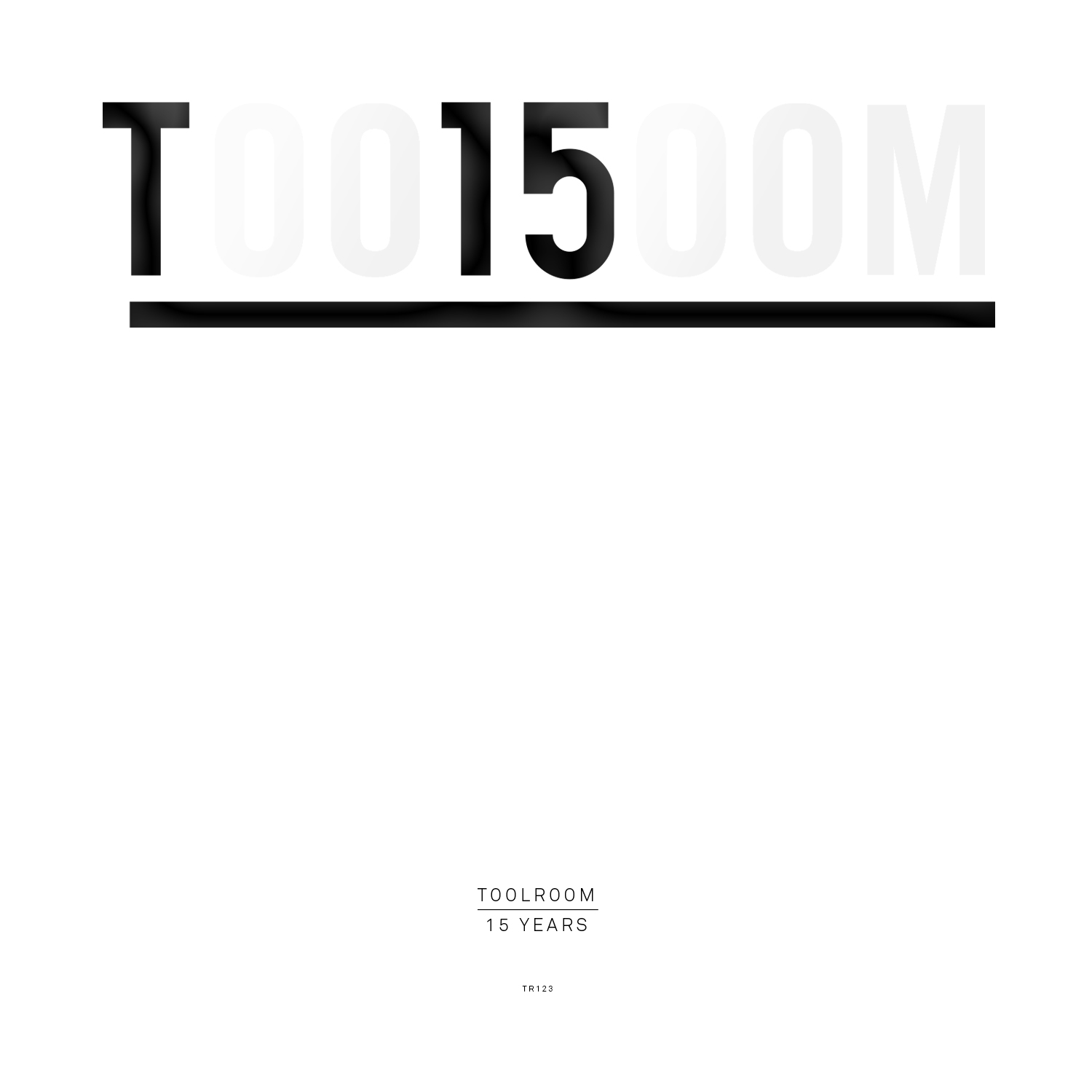
The findings helped create a very clear picture of how they should look, sound and behave. A bold, distinctive, typographic style formed the backbone of their new visual identity, with the logo becoming the letter T from their name. The overall punchy graphic style then flowed from this.
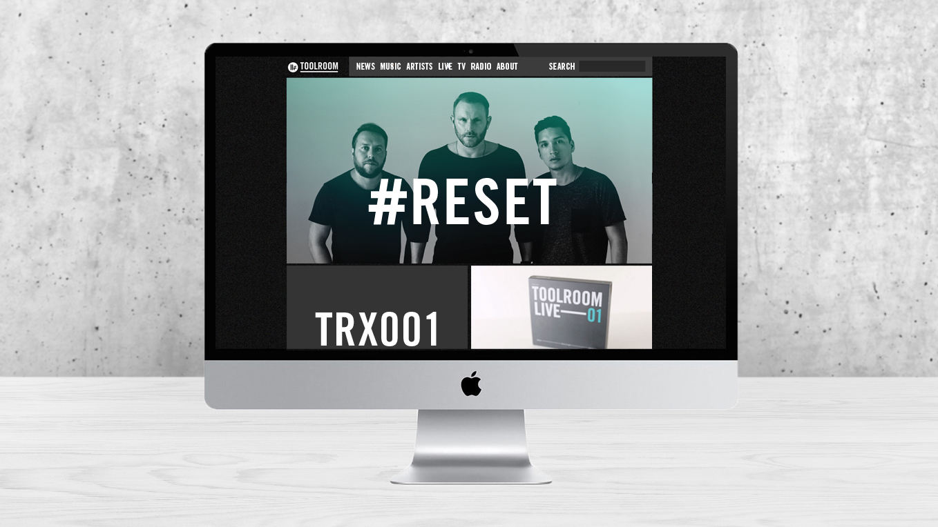
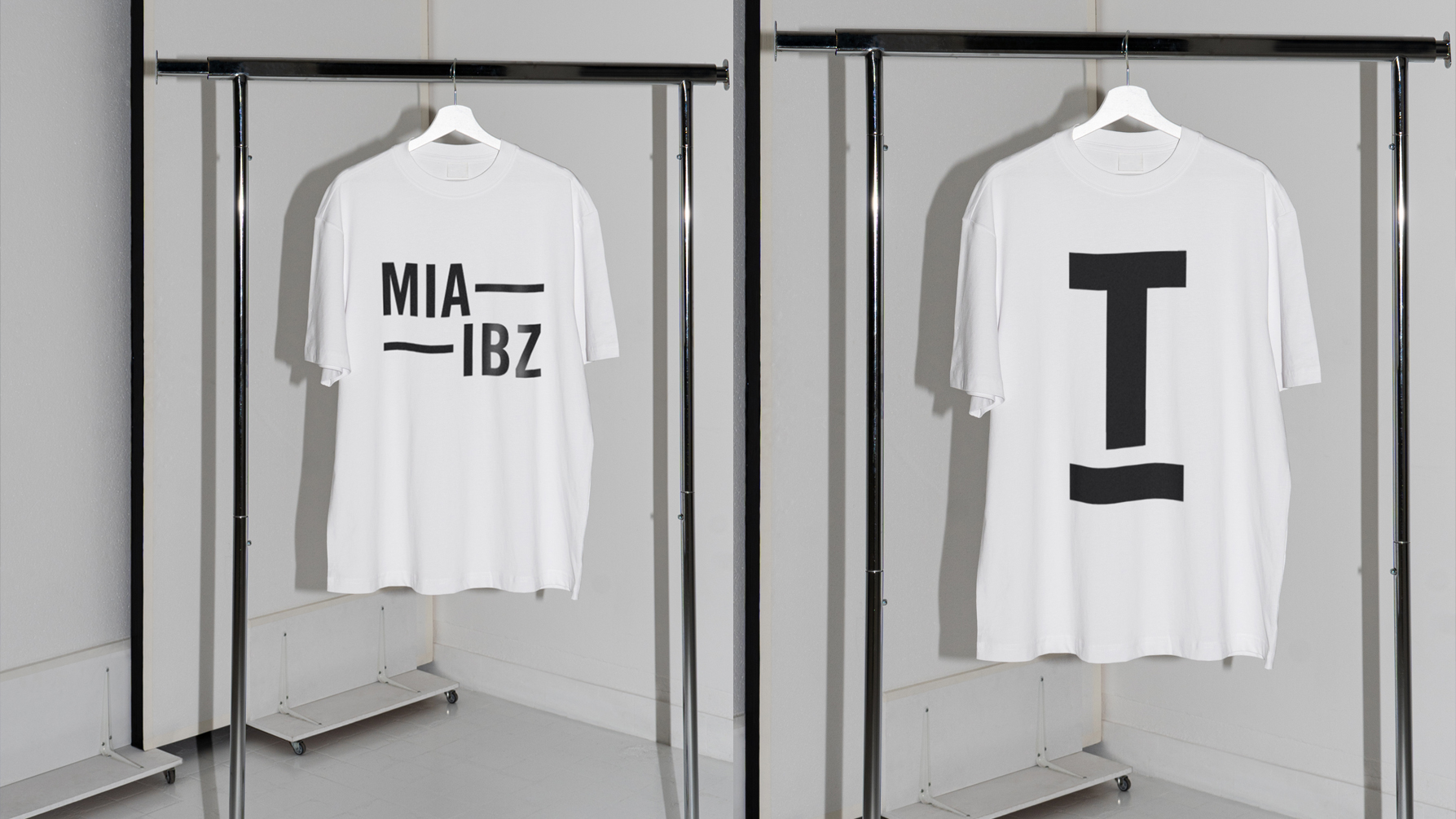
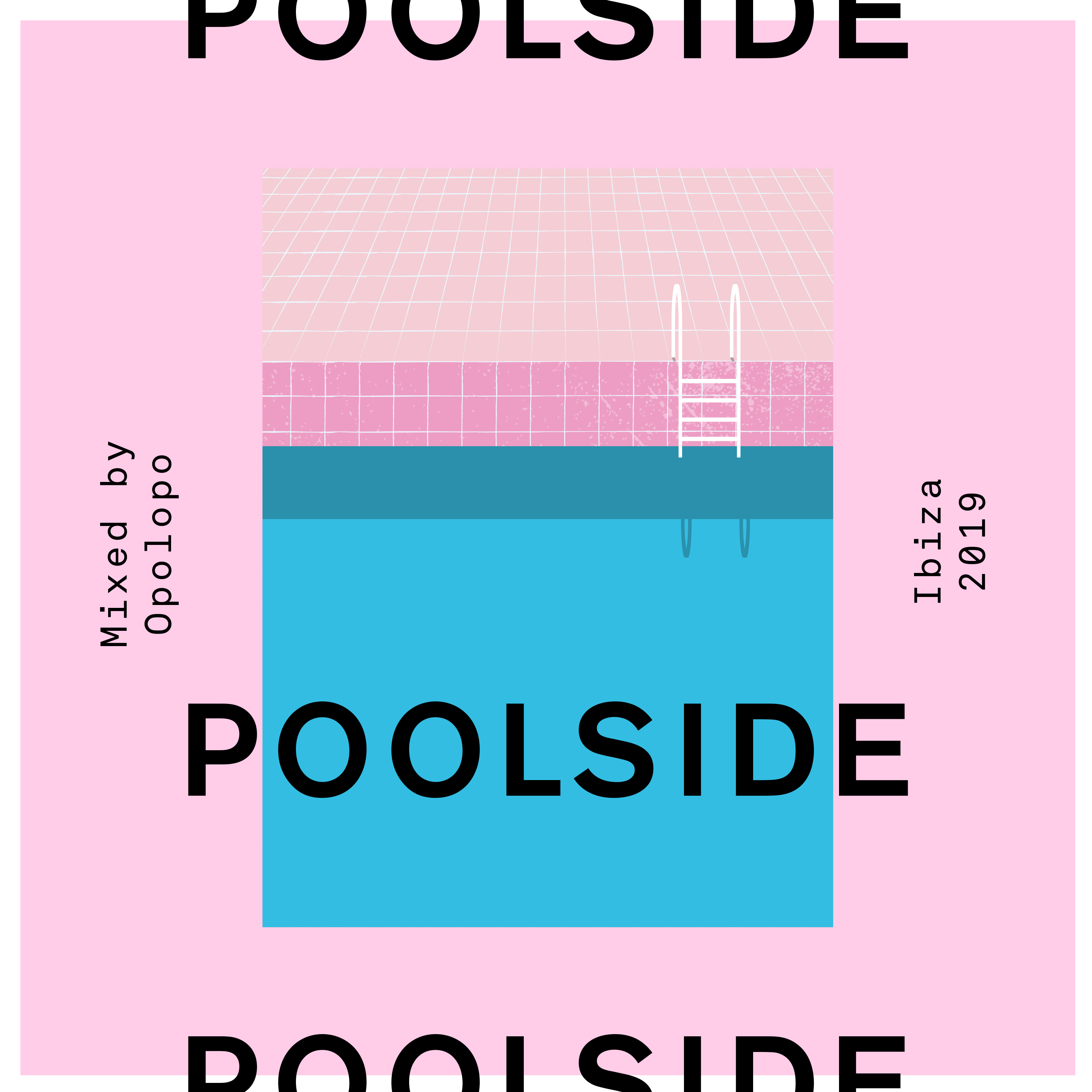
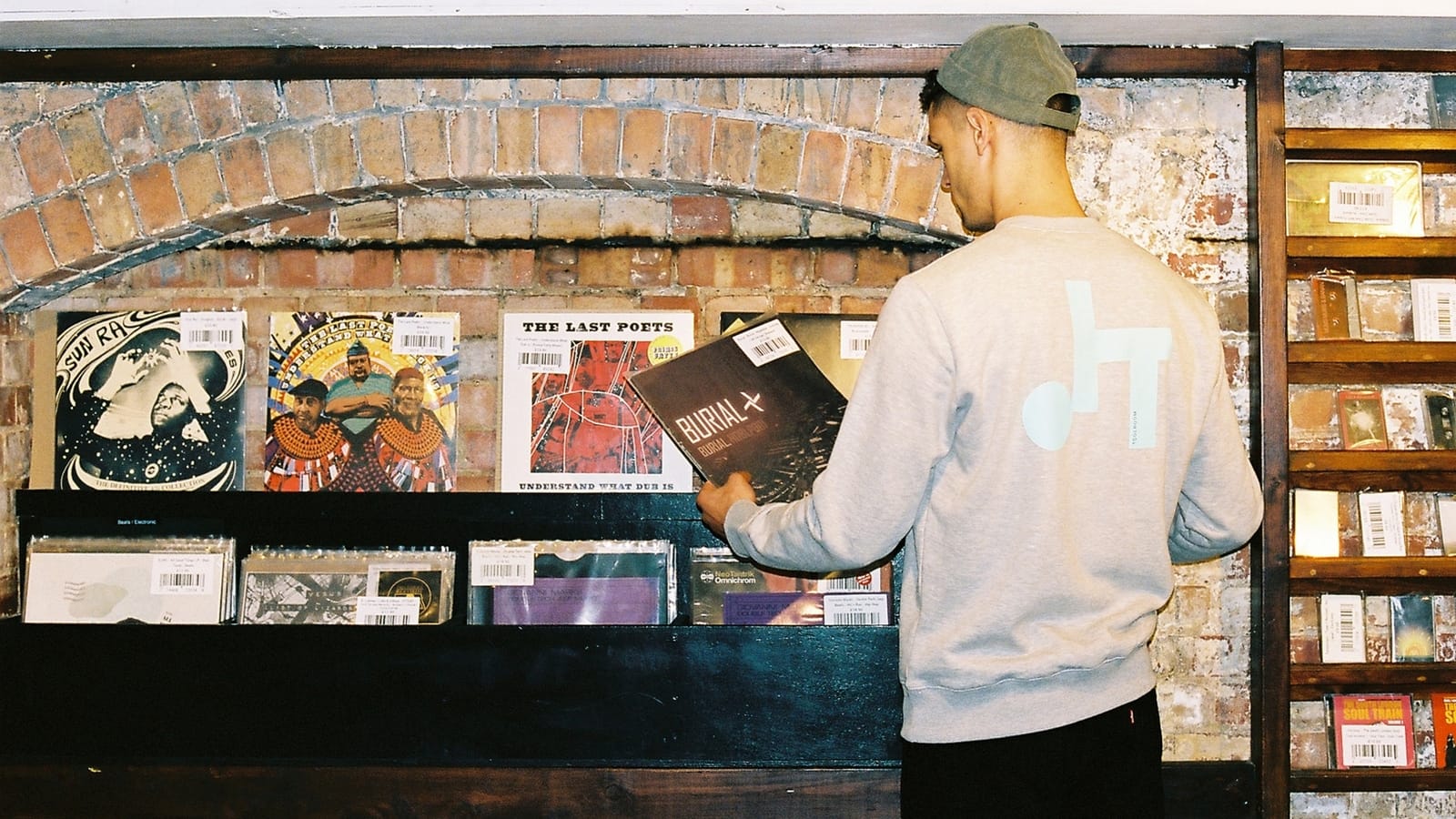
I gave them not just a logo but an approach to design in general that they could follow internally. Albums, singles, event design, social media, marketing collateral, merchandise, all went through this filter.

I was also able to aid them in terms of their positioning within the market and the structure of the company. Using the research helped resolve thorny questions about music policy and led to the creation of new brands and product lines to appeal to their consumers in a specifically targeted way.
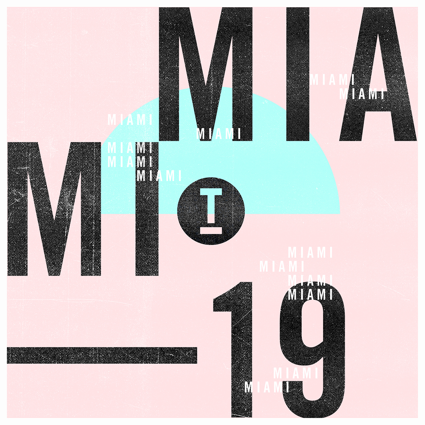
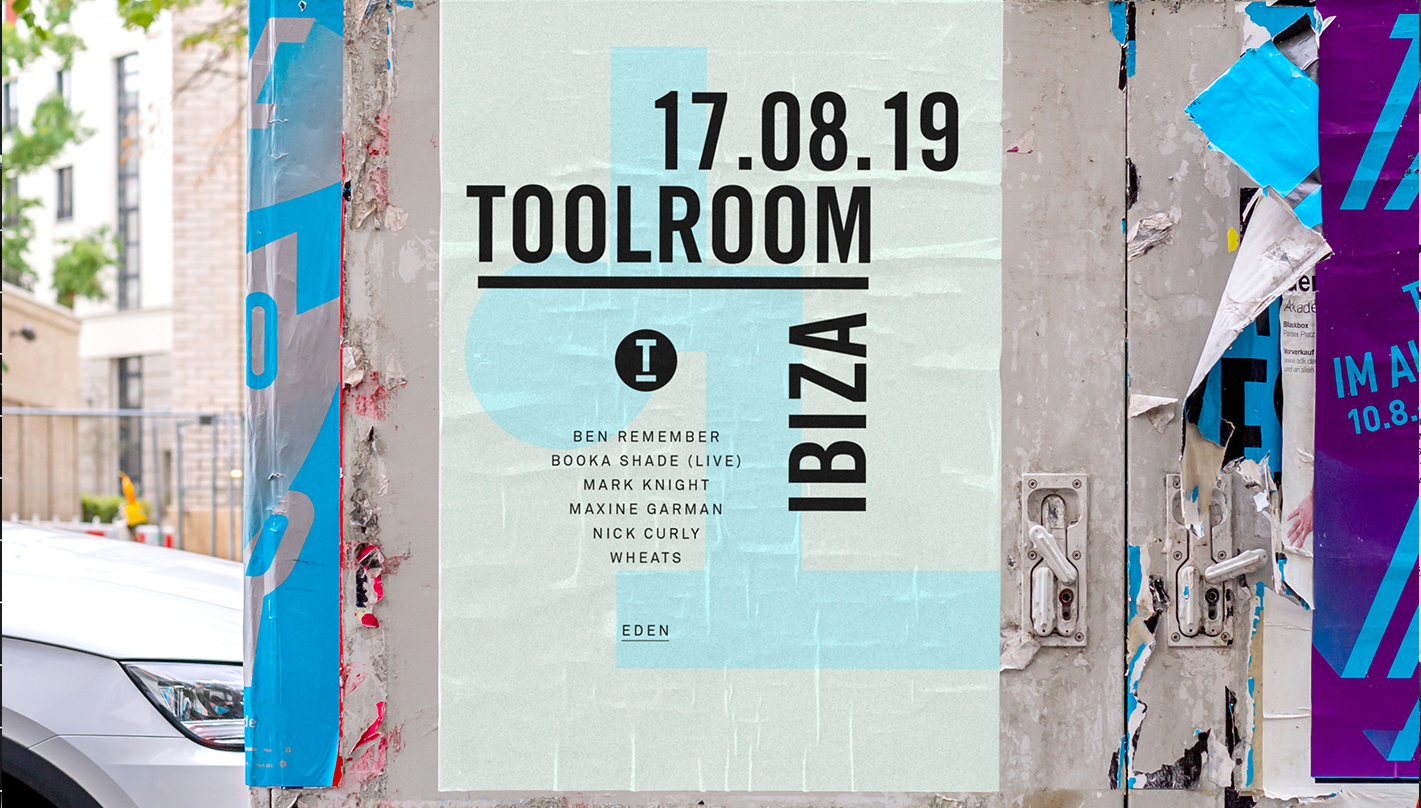
The simplicity of the overall design strategy made the creation of collateral and the generation of ideas quick, easy and coherent. But the flexibility has allowed for variation and development over the years. Digital singles, which they released with great regularity, became a series of different graphic interpretations of the T logo, which could be produced with speed. Consistent in structure but varied in style.


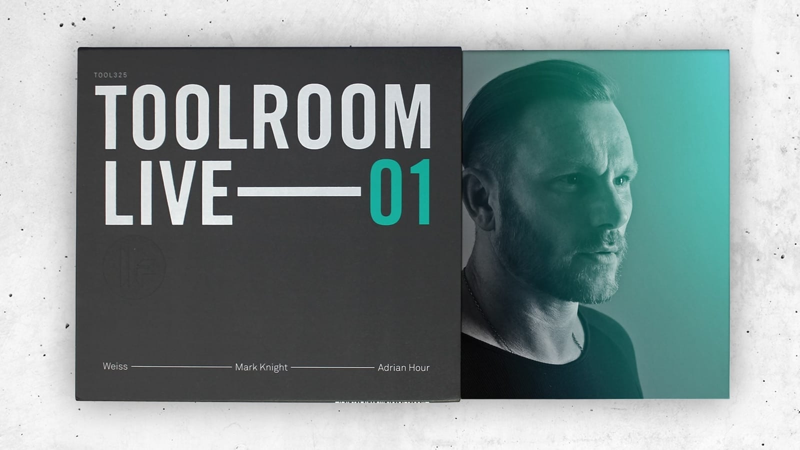
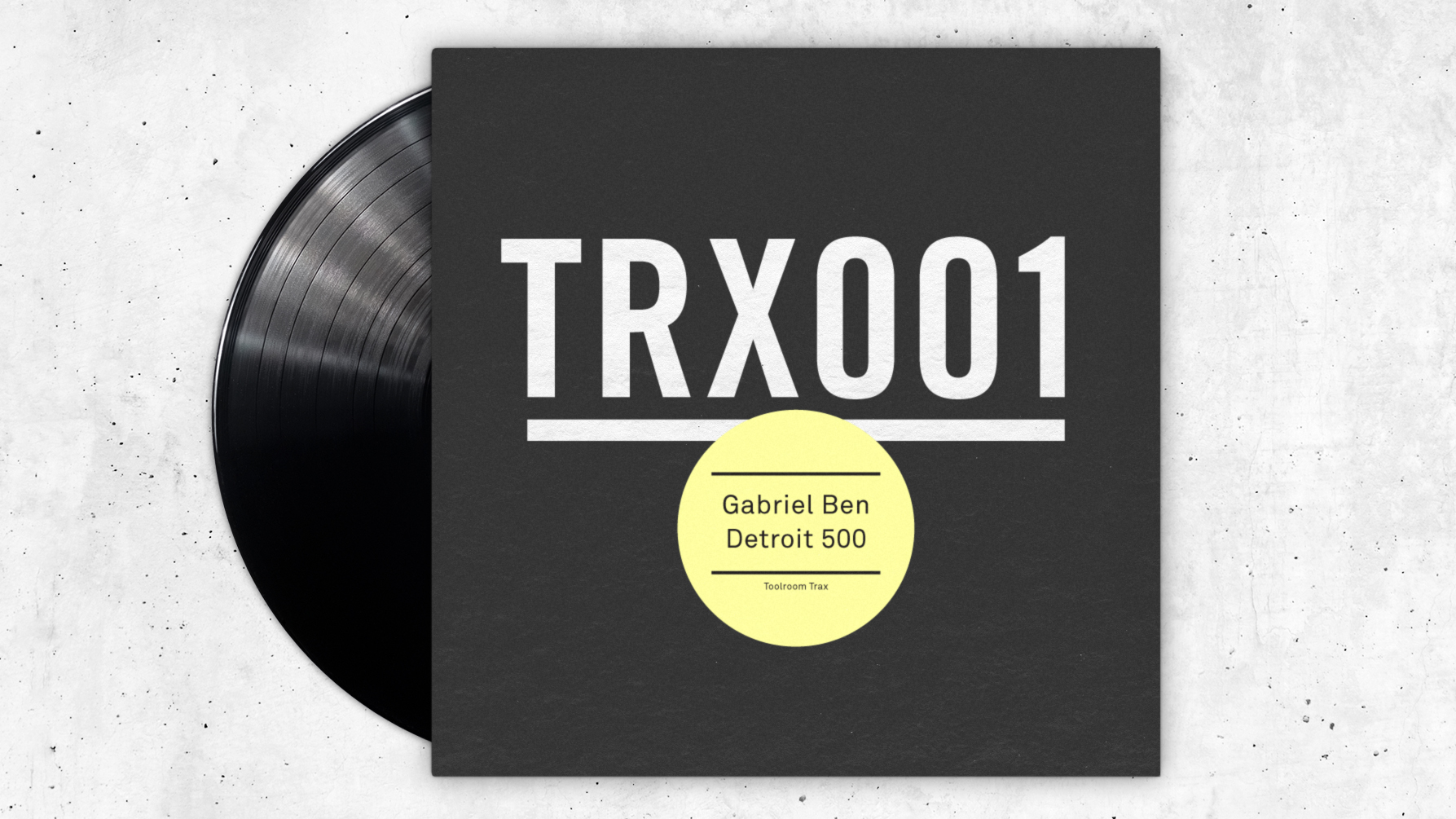
Having established this new look, the next stage of the process was to develop the identity further. After a couple of years I began to loosen and break apart the logo and typography to create a more flexible style.
Using the geometry of the now highly recognisable T logo I was able to create new designs for singles, albums, event promotion, merchandise and social media.
Broadening the scope of the brand further, I underwent an additional research process with the aim of identifying an underlying purpose for the brand that would run through their marketing and tone of voice.
What this uncovered was a very strong connection with Toolroom’s fans. There was a genuinely reciprocal affection between the staff and consumers that created an inclusive, close-knit relationship which I felt should form the basis of their future activity.

Working with Simon has been a fantastic process. What impressed me most was the clarity and intelligence he brought to the project, being able to deduce the core values of our brand aided the creative process enormously.
Simon’s creative execution of the rebrand was outstanding – it has totally reinvigorated the company. Most importantly, Simon has equipped us with the tools to take the brand forward ourselves, more than delivering on the project brief.
We called this strategy Toolroom Family, under the banner of which they’ve undertaken many initiatives to cement these ties, from setting up a DJ academy, which alone has almost doubled their business, sponsoring young sporting talent to making their fans the subject of several pieces of creative work - including a short film where they travelled the globe interviewing them.

The project has been a huge success with the brand enjoying an unprecedented critical and commercial boom as a result. They’re a lovely bunch of people and I couldn’t be happier for them.